Our very own Kesia Nagata has recorded all the raw tracks for her debut album, Looking For Horses, and now we need to nail down the CD cover design. That’s where you come in!
We’ve narrowed it down to a few different album cover ideas and now we’d like to know what you think/like. Just let us know your favorite in the Comments section below.
READY? Here we go…
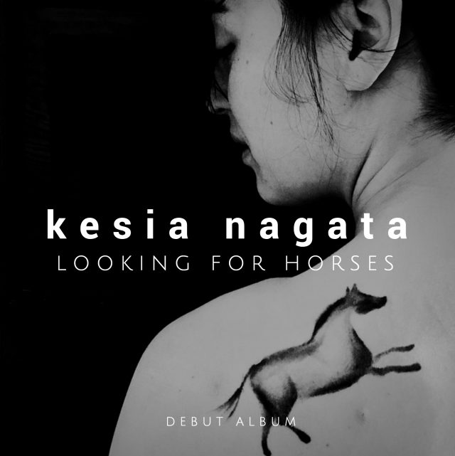
#1

#2

#3
#4

#5
#6

Okay. WHICH ONE is your favorite?? Don’t be shy – let us know, the more opinions, the better!
And for everyone who responds, we’ll draw names and the winner will receive a free CD as soon as they’re ready. If you love soulful, beautiful music, with words that are more like poetry, then you are going to love Kesia’s debut offering. She has been writing her own songs and performing live for almost a decade. Many people have compared her to Tracy Chapman (don’t know what Kesia thinks of that, but there it is!).
She’s currently adding in some layers of violin, percussion, and cello to some of the tracks and then they’ll be ready for the final mix and mastering. For those of you who missed it, here’s her newest song that’s going to be on the album:
We’ve also got a free gift for all of you – a free download (another of her wonderful songs called, Bring Me All The Way Down), for your iPod or mp3 player. Just click here and enter your name and email, and we’ll get that right out to you.
BUT before you do that – remember to tell us your favorite album cover design (#1,2,3,4,5 or #6?) in the Comments below… and thank you! 🙂
Jini Patel Thompson is a natural health writer and Lazer Tapping instructor. She began riding at age 2 in Kenya, and got her first horse at age 8 in Alberta, and so continues a life-long journey and love affair with these amazing creatures.


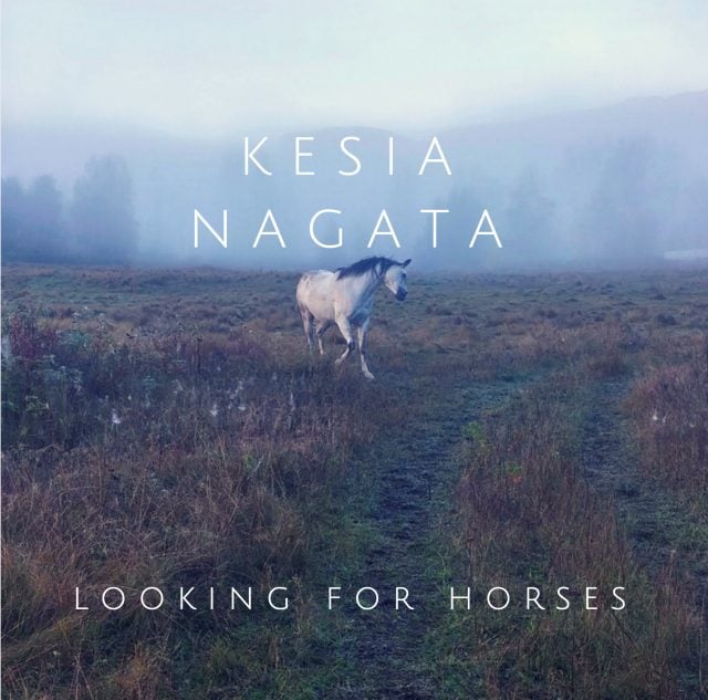
They are all really great cover designs and it’s hard to choose one. But I will choose #4 as I love early misty mornings..still laying in bed dreaming of horses..or getting up right after dawn and go out to the barn to spend some extra time with my ponies..watching..listening.
=-) Deb in Indiana
Hi ladies…my vote is for number 3…. I feel it shows a small insight into Kesia. They are all good variations so I don’t think you can go wrong but that is the one that personally resonated with me for an album cover.
Good energy to you and your album release…I hope all that you wish for is on the horizon with your music…it is truly a gift to have the gift of song in your soul.
#3 altho #4 a close second…
Number 1… though they are all beautiful… I like the space and simplicity…
Speaking of beautiful Kera – I just went and had a look at your new site! Looks fabulous!! I would love to come see what you do, so I’m going to see if my daughter and a friend would like to do your July camp… I think this kind of connecting kids with animals and nature is nothing short of CRUCIAL for our planet and our future. You go girl!!
2, 3 or 5 🙂
Okay – just added a new one – #6! Kesia wanted to see that one in black & white 🙂
I like number 6!
I choose # 3. I would like to see more options as all the options are the same really except # 3.
#5. As she sings “Looking For Horses” the horse is looking for horses as well…..
All of the scenery is absolutely beautiful, as is the gorgeous horse. Not wanting to be a critic, I hesitate to draw your attention to the head position of the horse, but it seems a strange position and I think detracts from the beauty of the photo. The one of Kesia is shot at a beautiful angle, and she is clearly gorgeous, but for the title of the album, I think the misty horse pictures are the ones to go with as they will surely represent the ‘mystical’ sounds you say are presented on the CD. I do hope you will see my comments in the spirit they are given, and not critical.
I love your posts, and you are now the only ‘horse related’ articles I am subscribed to.
Highest regards,
Jan (Australia)
I Like them all but #6 is my choice – the sepia tone is intriguing.
Well done for getting to this point – I look forward to hearing more of your music 🙂
Cheers, Cynthia.
#5. It seems the most fitting
I choose #5 or #6.
Beautiful!! ?
Hi my vote is for number 1, simple and direct as well as very clear.
I like #5 as opposed to #4 as I like her name in white on top of the misty morning. They are all great. I am so excited for her new CD and love the title. Shivam
Without a doubt, my choice is #3. It gives me a real sense of who Kesia is (her energy, presence, etc) mixed with her deep love of horses.
nancy
#3 with #4 a close runner up.
The font looks thin, brittle. Maybe try a more spiritual font?
Definitely #1. There is a feeling of space and quiet simplicity.
I like the one with Keisha and her tattoo. This is really what the album is about – her ))
Is it too late to vote!!!
I love them all..however I’m partial to the one with Kesia….that is first off a vulnerable place…there behind the ear and neck….so it makes me think of the first album as something treasured and vulnerable…and connection to the ancestors of the horse and her on her human flesh…it brings on a sense of mystery and honor of her spirit and horses..❤❤❤
No it is not too late! And I LOVE the reasons you’ve given here… I’m actually becoming partial to this one myself, but what you’ve written here helps explain WHY I’m being drawn to that one.
Guliz…what you wrote was absolutely amazing …I picked that cover also..but how you described it was very moving. ✌?️❤️?
Okay for those of you who chose #1 – does this give you the same feeling? Do you like it as much as the version above – with the horse in the field?
#5. Looks a lot like my Shiloh.
Definitely Number 3 exactly as shown. Very cool.
I would choose #3, however I would actually love to see a black and white shot in the mist of Kesia on a porch with her 3 horses in the distance. More of a true expression of her and her horses, and the theme.
Great idea!
Wow!! I think I have found a new summer play list..so beautiful.
I choose number 3
Because its organic looking and shows an unexspected vunerability.
I prefer # 1 ( the original) and my second best is # 1 ( second version ) . They are all very nice though. Good job !
I love numbers one and three, for very different reasons. I’m a graphic designer, so very picky about these things….for what that’s worth! Sending deep gratitude to both you and Kesia for all the wonderful magic you bring to me and to this old world. Love from the Montana prairie.
Meghan
Thanks Meghan and good to have feedback from a pro! Sending love and horse kisses right back atcha 🙂
YAY! We have a winner for this contest! Find out who it is…
https://www.listentoyourhorse.com/winner-of-looking-for-horses-cd-album/
And a BIG THANK YOU to everyone who contributed here 🙂